How to use TailWind CSS for a Beginner ?


Table of contents
- What is Tail-Wind CSS and Why it has became popular?
- Let's find Installation way as we know importance of TailWind CSS
- What is the main advantage of Tailwind CSS?
- Lets go to the next amazing feature in the Tailwind CSS
- Another last Amazing feature is First-Party Plugin
- How the TailWind CSS utility classes makes code life easier?
- How to handle Hover, Focus and other CSS components in Tailwind CSS ?
- Lets learn how to write responsive design in Tailwind
- How to use the Flex and Grid in Tailwind CSS?
- Few Tailwind CSS commands for Grid
- Few Tailwind CSS commands for Flex
What is Tail-Wind CSS and Why it has became popular?
Initially tailwind was designed for mobile first application by Facebook later it was made as open-source.
Tailwind CSS is basically a utility-first CSS framework for rapidly building custom user interfaces. It is a highly customizable, low-level CSS framework that gives you all of the building blocks you want to build a designs. By using the utility-first framework, you don't have to write custom CSS to style your application. Instead, you can use utility classes to control the padding, margin, color, font, shadow, and more of your application. In tailwind we can create our own custom configurations like colors, screen .. etc. every component present in CSS.
Tailwind is not a UI Kit like Bootstrap, Foundation, or Bulma. It does not provide ready-made design blocks. It provides a catalog of CSS classes that makes the process of styling more convenient. It prevents the user from writing lengthy code, and it even makes a greater level of creativity as compared to the other frameworks that come with built-in UI components that is the reason marked as very popular.
Let's find Installation way as we know importance of TailWind CSS
We need to add the TailWind CDN to our html code which imports a style sheet of TailWind CSS inorder to use in our application
<!doctype html>
<html>
<head>
  <meta charset="UTF-8">
  <meta name="viewport" content="width=device-width, initial-scale=1.0">
  <script src="https://cdn.tailwindcss.com"></script>
</head>
<body>
What is the main advantage of Tailwind CSS?
TailWind has provided a feature of customizing our own configuration so lets find how to write a code to customize and will get to know it in detail
<!doctype html>
<html>
<head>
  <meta charset="UTF-8">
  <meta name="viewport" content="width=device-width, initial-scale=1.0">
  <script src="https://cdn.tailwindcss.com"></script>
  <script>
    tailwind.config = {
      theme: {
        extend: {
          colors: {
            mycustomizedcolor1 : '#da373d',
            mycustomizedcolor2: #fff
          }
        }
      }
    }
  </script>
</head>
<body>
  <h1 class="text-3xl font-bold underline text-mycustomizedcolor1 ">
    Hello world!
  </h1>
</body>
</html
Here colors are customized i can use mycustomizedcolor1 while using scripting code in tags.
Lets go to the next amazing feature in the Tailwind CSS
Lets drive into the some custom CSS features provided by tailwind which is nothing but combo of tailwind css styles and the custom css which makes easier to make UI pages easier.
Use type="text/tailwindcss" to add custom CSS that supports all of Tailwind's CSS features.
<!doctype html>
<html>
<head>
  <meta charset="UTF-8">
  <meta name="viewport" content="width=device-width, initial-scale=1.0">
  <script src="https://cdn.tailwindcss.com"></script>
  <style type="text/tailwindcss">
    @layer utilities {
      .content-auto {
        content-visibility: auto;
      }
    }
  </style>
</head>
<body>
  <div class="lg:content-auto">
  </div>
</body>
</html>
Another last Amazing feature is First-Party Plugin
Tailwind proves enable first-party plugins, like forms and typography, using the plugins query parameter which enable the UI to look better.
<!doctype html>
<html>
<head>
  <meta charset="UTF-8">
  <meta name="viewport" content="width=device-width, initial-scale=1.0">
  <script src="https://cdn.tailwindcss.com?plugins=forms,typography,aspect-ratio,line-clamp"></script>
</head>
<body>
  <div class="">
  </div>
</body>
</html>
How the TailWind CSS utility classes makes code life easier?
Let find how utility classes make coder life easier while trying to write styling for html page
We will come to know how the tailwind css decreases the time spent for styling page
HtML Page with just css code
<div class="chat-notification">
  <div class="chat-notification-logo-wrapper">
    <img class="chat-notification-logo" src="/img/logo.svg" alt="ChitChat Logo">
  </div>
  <div class="chat-notification-content">
    <h4 class="chat-notification-title">ChitChat</h4>
    <p class="chat-notification-message">You have a new message!</p>
  </div>
</div>

<style>
  .chat-notification {
    display: flex;
    max-width: 24rem;
    margin: 0 auto;
    padding: 1.5rem;
    border-radius: 0.5rem;
    background-color: #fff;
    box-shadow: 0 20px 25px -5px rgba(0, 0, 0, 0.1), 0 10px 10px -5px rgba(0, 0, 0, 0.04);
  }
  .chat-notification-logo-wrapper {
    flex-shrink: 0;
  }
  .chat-notification-logo {
    height: 3rem;
    width: 3rem;
  }
  .chat-notification-content {
    margin-left: 1.5rem;
    padding-top: 0.25rem;
  }
  .chat-notification-title {
    color: #1a202c;
    font-size: 1.25rem;
    line-height: 1.25;
  }
  .chat-notification-message {
    color: #718096;
    font-size: 1rem;
    line-height: 1.5;
  }
</style>
HTML page code with Tailwind css
<div class="p-6 max-w-sm mx-auto bg-white rounded-xl shadow-lg flex items-center space-x-4">
  <div class="shrink-0">
    <img class="h-12 w-12" src="/img/logo.svg" alt="ChitChat Logo">
  </div>
  <div>
    <div class="text-xl font-medium text-black">ChitChat</div>
    <p class="text-slate-500">You have a new message!</p>
  </div>
</div>
We can see how the line of code got decreased that is the beauty of TailWind CSS.
How to handle Hover, Focus and other CSS components in Tailwind CSS ?
In tailwind we can write hover very easily, but in traditional css we need to write one style for color and hover.
<button class="bg-sky-500 hover:bg-sky-700">
  Save changes
</button>
Lets learn how to write responsive design in Tailwind
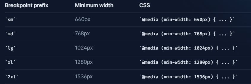
Utility class in Tailwind can be applied conditionally at different breakpoints, which makes it a piece of cake to build complex responsive interfaces without ever leaving HTML.
Here are some predefined breakpoints defined in Tailwind CSS. By using this we can adjust and make the pages responsive.
Here is one basic example how to write code in responsive and you can observe the meaning present what was written in the class, you can look how it was so simple and easy.
<!-- Width of 16 by default, 32 on medium screens, and 48 on large screens -->
<img class="w-16 md:w-32 lg:w-48" src="...">
lets see another simple example
div class="max-w-md mx-auto bg-white rounded-xl shadow-md overflow-hidden md:max-w-2xl">
  <div class="md:flex">
    <div class="md:shrink-0">
      <img class="h-48 w-full object-cover md:h-full md:w-48" src="/img/store.jpg" alt="Man looking at item at a store">
    </div>
    <div class="p-8">
      <div class="uppercase tracking-wide text-sm text-indigo-500 font-semibold">Case study</div>
      <a href="#" class="block mt-1 text-lg leading-tight font-medium text-black hover:underline">Finding customers for your new business</a>
      <p class="mt-2 text-slate-500">Getting a new business off the ground is a lot of hard work. Here are five ideas you can use to find your first customers.</p>
    </div>
  </div>
</div>
let us understand what is present in above code i will explain in detail
Here’s how the example above works:
- By default, the outer div is display: block, but by adding the md:flex utility, it becomes display: flex on medium screens and larger.
- When the parent is a flex container, we want to make sure the image never shrinks, so we’ve added md:shrink-0 to prevent shrinking on medium screens and larger
- Actually we could have just used shrink-0 since it would do nothing on smaller screens, but since it only matters on md screens
- On small screens the image is automatically full width by default. On medium screens and up, we’ve constrained the width to a fixed size and ensured the image is full height using md:h-full md:w-48
By this you may feel TailWind CSS is very easy but the main point here is we need to write classes perfectly.
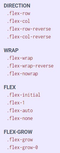
How to use the Flex and Grid in Tailwind CSS?
Lets understand what is flex and grid what is the basic difference between them, So the basic difference between CSS Grid Layout and CSS Flexbox Layout is: The flexbox was designed for layout in one dimension - either a row or a column. The Grid was designed for two-dimensional layout - rows, and columns at the same time.
Let's see the basic example in flex:
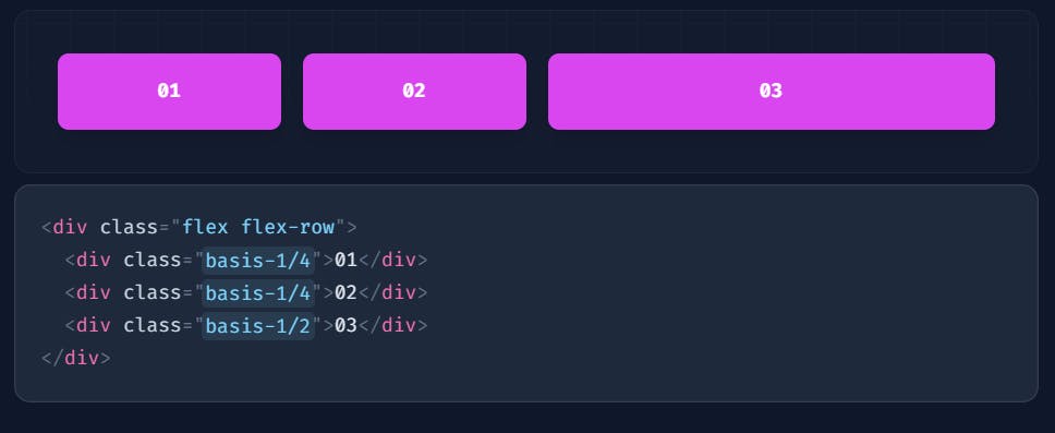
In above image we can see that those are placed in flex and direction was in row.
Let's see the basic example of grid:
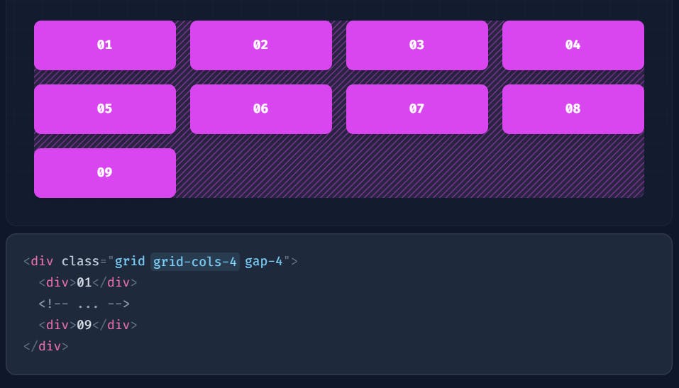
In above image we have 9 div's and they are displayed in 4 columns in every row because we have written grid-cols-{4} utility which creates grid with 4 equally sized columns and also equally spaces because we have written gap as 4.
Few Tailwind CSS commands for Grid
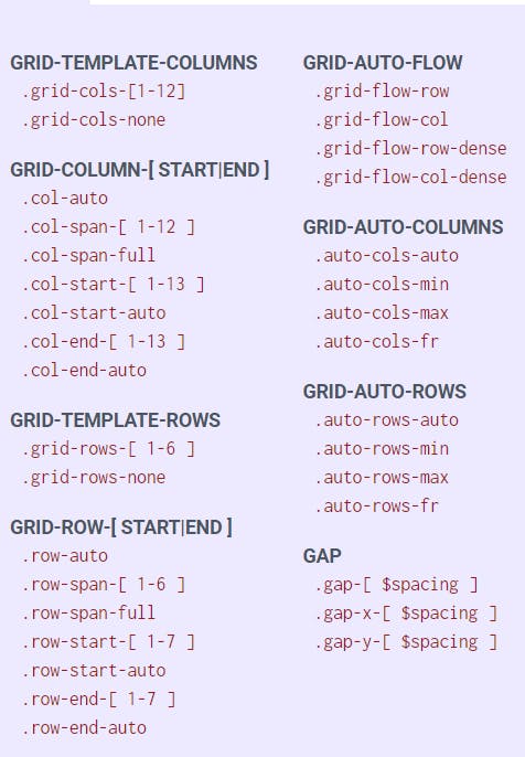
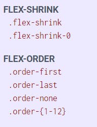
Few Tailwind CSS commands for Flex